Libraries Used:
- Bottom Sheet (Version 2): https://gorhom.github.io/react-native-bottom-sheet/
- Portal: https://github.com/gorhom/react-native-portal
- React Native Navigation: https://reactnavigation.org/
Goal
- Create a custom bottom bar with react navigation and a bottom sheet action button.
- If you are using expo the code will be the same. The installation of the libraries may be different.
Install the libraries
- React Native Navigation
yarn add @react-navigation/native
yarn add react-native-reanimated react-native-gesture-handler react-native-screens react-native-safe-area-context @react-native-community/masked-view
yarn add @react-navigation/bottom-tabs
yarn add @react-navigation/stack
yarn add react-native-safe-area-contex
yarn add react-native-screens
cd ios
pod install
- Import
react-native-gesture-handlera the top of theapp.tsxfile
import 'react-native-gesture-handler';
- BottomSheet (Your can use whatever bottom sheet library you want. They should all work the same). Make sure to install all dependencies as well!
yarn add @gorhom/bottom-sheet@^2
yarn add react-native-reanimated@^1 react-native-gesture-handler
cd ios
pod install
# https://docs.swmansion.com/react-native-gesture-handler/docs/#installation
- React Native Portal
yarn add @gorhom/portal
- React Native IonIcons (Optional)
yarn add react-native-ionicons@^4.x
React Native Project Structure
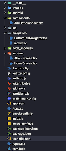
navigationdirectory - This will hold all of our code that has to do with anything navigation.screensdirectory - Holds all of the screens that our application will use.componentsdirectory - Holds shared components that can be re-used a crossed different screens & components.
Setting Up React Navigation
- First things first, let's create an
index.tsxfile. This will be the entry point of the navigation code. - We first need to setup a
NavigationContainerthat will be wrapped around ourRootNavigatorcomponent. createStackNavigator()- allows you to transition between screens. Screens are added and removed from the stack similar to as it is done on a normal web browser.- After we create our
Stackwe then define the screens that we want to be within the stack. For our purposes we wantroot&NotFound. This components are stacks themselves. Ourrootcomponent will be ourBottomTabNavigator(bottom tab bar)
navigation/index.tsx
import { NavigationContainer } from '@react-navigation/native';
import { createStackNavigator } from '@react-navigation/stack';
import * as React from 'react';

import { RootStackParamList } from '../types';
import BottomTabNavigator from './BottomTabNavigator';
import NotFoundScreen from '../screens/NotFoundScreen';

export default function Navigation() {
   return (
     <NavigationContainer>
       <RootNavigator />
     </NavigationContainer>
   );
}

const Stack = createStackNavigator<RootStackParamList>();

function RootNavigator() {
   return (
     <Stack.Navigator screenOptions={{ headerShown: false }}>
       <Stack.Screen name="Root" component={BottomTabNavigator} />
       <Stack.Screen name="NotFound" component={NotFoundScreen} options={{ title: 'Oops!' }} />
     </Stack.Navigator>
   );
}
Creating Bottom Tab Navigator
- First we need to create the bottomTabNavigator:
createBottomTabNavigator. This is the skeleton of the bottom bar. It allows us to navigate to different routes that we will define.

Once we have an instance of createBottomTabNavigator we can render the component
- Full list of
tabBarOptionshttps://reactnavigation.org/docs/bottom-tab-navigator
 <BottomTab.Navigator
      initialRouteName="Home"   // What tab do we want to default to
      tabBarOptions={{          // This gives us the ability to add addtional
        showLabel: false,       // options when we create the bottom tab
        style: {.               // most importantly the style component
          position: 'absolute',
          bottom: 25,
          left: 20,
          right: 20,
          backgroundColor: '#ffffff',
          borderRadius: 15,
          ...style.shadow,
          paddingBottom: 5
        }
      }}
      >
      ...
    </BottomTab.Navigator>
Now that we have the tab bar we will want to fill it up with some screens. In order to do that we can add the screens within the Bottom.Navigator component. For the sake of this blog post we will just have 2 screens. Home & About.
Each screen needs to have a name and a component . These components themselves are going to be stackNavigators. This will allow us to navigate to different pages within the currently selected tab.
We can also set specific options for each screen. Here we are calling a method in order to render an IonIcon
<BottomTab.Screen
	 name="Home"
   component={HomeScreenNavigator}
   options={{
      tabBarIcon: ({ color }) => <TabBarIcon name="home" color={color} />,
   }}
 />

<BottomTab.Screen
   name="About"
   component={ReminderScreenNavigator}
   options={{
      tabBarIcon: ({ color }) => <TabBarIcon name="alarm" color={color} />,
   }}
 />
const HomeScreenStack = createStackNavigator<HomeScreenParamList>();
function HomeScreenNavigator() {
  return (
    <HomeScreenStack.Navigator>
      <HomeScreenStack.Screen
        name="Home"
        component={HomeScreen}
        options={{ headerShown: true }}
      />
    </HomeScreenStack.Navigator>
  );
}

const AboutScreenStack = createStackNavigator<AboutScreenParamList>();
function ReminderScreenNavigator() {
  return (
    <AboutScreenStack.Navigator>
      <AboutScreenStack.Screen
        name="About"
        component={AboutScreen}
        options={{ headerTitle: 'About' }}
      />
    </AboutScreenStack.Navigator>
  );
}
Wrapping Up Boilerplate Navigation Code
- Once we have all of the above, it is time to wrap our entry component.
- Within
App.tsxwe want to import ourNavigationcomponent that we defined earlier. - We also want to wrap
NavigationwithinSafeAreaProvider - Your
App.tsxfile should look like the following
import 'react-native-gesture-handler';
import React from 'react';
import { SafeAreaProvider } from 'react-native-safe-area-context';
import Navigation from './navigation';

const App = () => {
   return (
     <SafeAreaProvider>
			  <Navigation />
     </SafeAreaProvider>
   );
 };

 export default App;
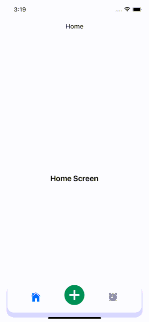
We should then be left with the following.
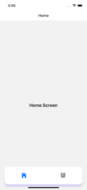
Everything we have done up to this point is standard react native navigation code. The real challenge comes when we want to add a custom button in the BottomTab to open a bottom sheet.
Setting up React Native Bottom Sheet
- In order to add another "tab" or "button" to our
BottomTabnavigator we must declare a new entry within it. - As we learned earlier each
BottomTab.Screenentry is required to have a component. In our case we can create anullcomponent since we want to open a bottom sheet component instead of navigating to a different page.
const AddScreenComponent = () => {
  return null;
}
- And then finally we nee to add this to our
BottomTabnavigator. Instead of rendering atabBarIconwe are going to use thetabBarButtonoption and then a function to render a customBottomSheetcomponent (AddBottomSheet) that we will define shortly.
...
<BottomTab.Screen
	  name="Add"
    component={AddScreenComponent}
    options={{
       tabBarButton: () => <AddBottomSheet />,
    }}
/>
...
- And that's it for the
BottomTabBar.tsxcomponent!
Full BottomTabBar.tsx Code
navigation/BottomTabBar.tsx
import Icon from 'react-native-ionicons';
import { createBottomTabNavigator } from '@react-navigation/bottom-tabs';
import { createStackNavigator } from '@react-navigation/stack';
import { StyleSheet } from 'react-native';
import * as React from 'react';
import HomeScreen from '../screens/HomeScreen';
import AboutScreen from '../screens/AboutScreen';
import AddBottomSheet from '../components/AddBottomSheet';
import {
  BottomTabParamList,
  HomeScreenParamList,
  AboutScreenParamList
} from '../types';

const BottomTab = createBottomTabNavigator<BottomTabParamList>();

export default function BottomTabNavigator() {
  return (
    <BottomTab.Navigator
      initialRouteName="Home"
      tabBarOptions={{
        showLabel: false,
        style: {
          position: 'absolute',
          bottom: 25,
          left: 20,
          right: 20,
          backgroundColor: '#ffffff',
          borderRadius: 15,
          ...style.shadow,
          paddingBottom: 5
        }
      }}
      >
      <BottomTab.Screen
        name="Home"
        component={HomeScreenNavigator}
        options={{
          tabBarIcon: ({ color }) => <TabBarIcon name="home" color={color} />,
        }}
      />
      <BottomTab.Screen
        name="Add"
        component={AddScreenComponent}
        options={{
          tabBarButton: () => <AddBottomSheet />,
        }}
      />
      <BottomTab.Screen
        name="About"
        component={ReminderScreenNavigator}
        options={{
          tabBarIcon: ({ color }) => <TabBarIcon name="alarm" color={color} />,
        }}
      />
    </BottomTab.Navigator>
  );
}

function TabBarIcon(props: { name: React.ComponentProps<typeof Icon>['name']; color: string }) {
  return <Icon size={30} style={{ marginBottom: -3 }} {...props} />;
}

const HomeScreenStack = createStackNavigator<HomeScreenParamList>();
function HomeScreenNavigator() {
  return (
    <HomeScreenStack.Navigator>
      <HomeScreenStack.Screen
        name="Home"
        component={HomeScreen}
        options={{ headerShown: true }}
      />
    </HomeScreenStack.Navigator>
  );
}

const AboutScreenStack = createStackNavigator<AboutScreenParamList>();
function ReminderScreenNavigator() {
  return (
    <AboutScreenStack.Navigator>
      <AboutScreenStack.Screen
        name="About"
        component={AboutScreen}
        options={{ headerTitle: 'About' }}
      />
    </AboutScreenStack.Navigator>
  );
}

const AddScreenComponent = () => {
  return null;
}

const style = StyleSheet.create({
  shadow: {
    shadowColor: '#7F5DF0',
    shadowOffset: {
      width: 0,
      height: 10
    },
    shadowOpacity: 0.25,
    shadowRadius: 3.5,
    elevation: 5,
  }
});
Creating the BottomSheet Component AddBottomSheet.tsx
- This component will be displayed on the bottom bar so therefore we want it to look like a button when the
BottomSheetis not presented.
<TouchableWithoutFeedback onPress={onAddButtonPress}>
    <Icon size={65} name='add-circle' color={'#00a16e'} />
</TouchableWithoutFeedback>

const onAddButtonPress = () => {
	console.log('button pressed');
}
- Now it is time to add the
BottomSheetcode.
import BottomSheet from '@gorhom/bottom-sheet';
import * as React from 'react';
import { StyleSheet, View, Text, TouchableWithoutFeedback, } from 'react-native';
import Icon from 'react-native-ionicons';
import { Portal, PortalHost } from '@gorhom/portal';

const AddBottomSheet = () => {
	// Creates a reference to the DOM element that we can interact with
	const bottomSheetRef = React.useRef<BottomSheet>(null);

	// Setting the points to which we want the bottom sheet to be set to
	// Using '-30' here so that it is not seen when it is not presented
	const snapPoints = React.useMemo(() => [-30, '75%'], []);

	// Callback function that gets called when the bottom sheet changes
	const handleSheetChanges = React.useCallback((index: number) => {
		console.log('handleSheetChanges', index);
	}, []);

	// Expands the bottom sheet when our button is pressed
	const onAddButtonPress = () => {
		bottomSheetRef?.current?.expand();
	}

   return (
   	<>
         <TouchableWithoutFeedback onPress={onAddButtonPress}>
             <Icon size={65} name='add-circle' color={'#00a16e'} />
         </TouchableWithoutFeedback>
					<BottomSheet
						ref={bottomSheetRef}
						index={-1} // Hide the bottom sheet when we first load our component
						snapPoints={snapPoints}
						onChange={handleSheetChanges}
					>
					<View style={styles.contentContainer}>
						<Text style={styles.bottomSheetTitle}>Add Customer</Text>
					</View>
				</BottomSheet>
      </>
   )
}

export default AddBottomSheet;

const styles = StyleSheet.create({
	container: {
		flex: 1,
		padding: 24,
		backgroundColor: 'grey',
	 },
	 contentContainer: {
		flex: 1,
		paddingLeft: 50
	 },
	 bottomSheetTitle: {
		 fontSize: 24,
		 fontWeight: '500'
	 }
});
- When we run our project now we get some unintentionally behavior. When we click our button the bottom sheet does appear, however it is limited to the context of the bottom bar. This is obviously not what we want.

React Native Portal
- We can utilize
react-native-portalto fix this issue Portalsexist within normal react. Portals are a way to render children into a DOM node exist outside of the parent component.- In our case we want our
BottomSheet(Child Component) to be rendered outside of theBottomTabBar(Parent Component) - In order to accomplish this we first need to set up a
PortalProviderwithin ourApp.tsxfile. This tells ourBottomSheetthat we want it rendered at this level. Outside of our navigation code.
import 'react-native-gesture-handler';
import React from 'react';
import { SafeAreaProvider } from 'react-native-safe-area-context';

import Navigation from './navigation';
import { PortalProvider } from '@gorhom/portal';

 const App = () => {

   return (
     <SafeAreaProvider>
		  <PortalProvider>
			  <Navigation />
		  </PortalProvider>
     </SafeAreaProvider>
   );
 };

 export default App;
- Once we have done that we need to wrap our
BottomSheetcomponent inside of thePortalcomponent and set aPortalHost
...
import { Portal, PortalHost } from '@gorhom/portal';
...
const AddBottomSheet = () => {

	...
   return (
   	<>
		...
			<Portal>
				<BottomSheet
					ref={bottomSheetRef}
					index={-1}
					snapPoints={snapPoints}
					onChange={handleSheetChanges}
					>
					<View style={styles.contentContainer}>
						<Text style={styles.bottomSheetTitle}>Add Customer</Text>
					</View>
				</BottomSheet>
			</Portal>

			<PortalHost name="custom_host" /> // Name to be used as an id
      </>
   )
}

...
- After that everything should be working correctly. Our
BottomSheetis now being rendered outside of theBottomTabBar
Conclusion
- Well there you go. A customizable way to create a
BottomTabBarwith aBottomSheetand React Native Navigation - If you have any question please leave them in the comments, or feel free to reach out to me on twitter @jeff_codes
- Link to the full working Github Repo: https://github.com/edmondso006/React-Native-Custom-BottomBar-With-BottomSheet
Tutorial: React Native Custom Bottom Bar with BottomSheet
This tutorial goes over how to create a custom bottom bar with react navigation and a bottom sheet controlled action button